 4 Description of eLML Structure
The following description of the eLML structure explains every eLML element
in detail. It is structured in about the same order as the elements are
used within a lesson. While here the focus is laid on the description and
the use of each element the reference manual in HTML format provided together
with the eLML structure can be used to see all the elements, their attributes
and relationships with less explanations. There, only very small descriptions
of the elements are given but all the elements in the graphics and tables
are linked and their relationship can be explored.The description and explanations of the elements in this chapter are relevant when using the standard eLML XML-Schema files (elml.xsd, biblio_harvard.xsd, metadata_elml.xsd and config.xsd - in the config folder). Explanations how the config.xsd file can be adapted to suit the needs of your own eLearning project can be found in chapter 3.3.
Additionally, also the examples of code and representation are only valid with the above mentioned eLML XML-Schemas and the standard xsl files provided (elml.xsl). Explanations how the representation can be adapted can be found in chapter 7.4.
The examples given are only hints how it could be done. There may be several other ways how it could be done. The examples should give you an overview and an idea how it can be used and also what the meaning of a specific element is. For additional ideas, especially for the didactical conception of a eLearning lesson, you might want to see other eLearning instruction books and articles.
The eLML structure does not include student management, formal assessments (tests) nor any evaluation possibilities. Such parts could be done in an eLearning platform like WebCT, OLAT or any other platform that serves the purpose and needs.
 4.1 Lesson Level
The lesson level consists of the elements <entry>, <goals>,
<unit>, <selfAssessment>, <summary>, <furtherReading>,
<glossary>, <bibliography> and <metadata>. All of these
elements, except <unit>. <bibliography> and <metadata>
are described further in the following paragraphs. These elements are
documented in separate sections below.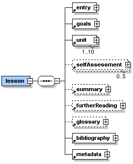 |
Description: <lesson> is the root element of any eLML.xml file. It encloses all other elements and all of the content. Direct sub-elements of <lesson> are the basic elements of every eLearning lesson <entry>, <goals>, <unit>, <selfAssessment>, <summary>, <furtherReading>, <glossary>, <bibliography> and <metadata>. No text is allowed inside the <lesson> element. A lesson is thought to be one chunk of eLearning material which can be 'digested' by a student in about 1-3 hours. Think of it as about 1-2 face-to-face lessons you would teach in a classroom. Sometimes it might not be possible to stick to this rule but try to create not very small nor very large lessons but keep them all about the same size. It might be advisable to split up a extensive topic into two lessons instead of creating one very big lesson. Try to give your lessons short and meaningful titles. |
The root element <lesson> occurs once and only once within the eLML document.
Attribute(s):
| Name: | Use: | Value: |
| lessonLabel | required | The attribute lessonLabel contains one of the lesson labels specified in the config.xsd XML Schema file. All possible lesson labels are defined in this Schema file and can then be used within the attribute lessonLabel. |
| title | required | The attribute title contains a string representing the title of the current eLearning lesson. |
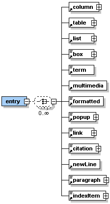 |
Description: <entry> is the first sub-element of the <lesson> element. It can contain one or more of the sub-elements listed in the graphic on the left hand side. Generally, in the <entry> element there is place to make introductory statements. An 'entry' could, for example, be: - what is to be discussed in this lesson - the context in which this lesson fits - a scenario to personify this lesson - an explanation of why this topic is being introduced - the historical perspective in which this lesson fits - etc. |
The element <entry> occurs once within the <lesson> element.
Attribute(s):
| Name: | Use: | Value: |
| label | optional | The attribute label can contain a user defined label of the entry part. The label is defined to consist of up to 12 characters (a-z, A-Z, 0-9 and _). Labels need to be unique within a lesson. |
| title | optional | The attribute title contains a string representing the title of the entry part. |
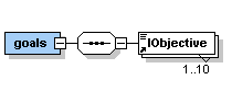 |
Description: <goals> is the second sub-element of the <lesson> element. It contains at least one but up to ten elements <lObjective>. |
The element <goals> occurs once within the <lesson> element.
Attribute(s):
none
 |
Description: Each <lObjective> should contain one learning objective in text form. The learning objectives are instructions about what we want the student to be able to do/to know after they have studied this lesson. Use verbs and include specific conditions (how well or how many) that describe to what degree the students will be able to demonstrate mastery of the task. Examples: - The student will be able to show how geographic data can be viewed and accessed over the web. - The student will be able to appreciate how xml protocols have enabled web GIS. - The student will be able to evaluate some innovative geographic information services on the web. - etc. |
The element <lObjective> occurs at least once but up to ten times within the <goals> element.
Attribute(s):
| Name: | Use: | Value: |
| role | optional | The attribute role can contain the values 'tutor' or 'student'. Default value is 'student'. However, it is possible to define learning objectives which are not visible to the student by setting the value of the attribute role to 'tutor'. |
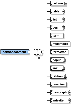 |
Description: <selfAssessment> is an optional sub-element of the <lesson> element. It can contain one or more of the sub-elements listed in the graphic on the left hand side. The self assessment part of a lesson should allow the student to check if they have achieved the learning objectives listed at the beginning of the lesson. This part can also help to create a community of learners what is a big challenge of online education. It is very important to have students share and exchange. A self assessment part could, for example, contain: - an un-assessed quiz to check the learners achievements - a peer evaluation of each other's work - a reflection of the lesson content through journal entries - engagement in team projects - participation in specific chat rooms - etc. It is important that all self assessment activities include some sort of feedback. Some feedback can be automated, for example, by online quizzes that provide the students with the correct answer or with links about where to go to get the correct answers. Other assessments may need peer feedback or feedback directly from the teacher/tutor. |
The element <selfAssessment> is optional but may occur up to five times within the <lesson> element.
Attribute(s):
| Name: | Use: | Value: |
| label | optional | The attribute label can contain a user defined label of the self assessment part. The label is defined to consist of up to 12 characters (a-z, A-Z, 0-9 and _). Lables need to be unique within a lesson. |
| title | optional | The attribute title contains a string representing the title of the self assessment part. |
| metaSetUpInfo | required | The attribute metaSetUpInfo contains simple text giving instructions to the tutors using this lesson in a course. For example, a self assessment part might require the setup of a discussion board with the discussion topic 'Problems with SQL'. In this case the author of the lesson writes the instruction "Set up discussion topic 'Problems with SQL'" in the attribute metaSetUpInfo. This information will be shown if the lesson content is viewed in the tutors view. |
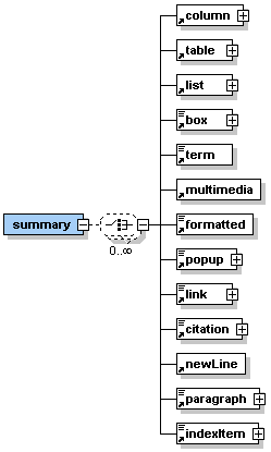 |
Description: <summary> is an optional sub-element of the <lesson> element. It can contain one or more of the sub-elements listed in the graphic on the left hand side. The summary part of a lesson provides an opportunity to summarize the experience, to encourage reflection about the process, to extend and generalize what was learned, or some combination of these. This part is quite important as it rounds out the lesson and provides the learners with a sense of closure. It is important that the summary condenses rather than describes knowledge. It should repeat in concise form the facts that learners should remember and not just list areas of knowledge. Sometimes it might be a good idea to summarize in graphics. It is possible to use a diagram, chart, table, or other graphical format if this is the best way to summarize content. |
The element <summary> occurs zero or once within the <lesson> element.
Attribute(s):
| Name: | Use: | Value: |
| label | optional | The attribute label can contain a user defined label of the summary part. The label is defined to consist of up to 12 characters (a-z, A-Z, 0-9 and _). Labels need to be unique within a lesson. |
| title | optional | The attribute title contains a string representing the title of the summary part. |
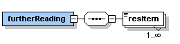 |
Description: <furtherReading> is a sub-element of the <lesson> element. It can contain one or many of the sub-elements <resItem>. The further reading section of a lesson contains an excerpt of the bibliography of the lesson. The excerpt should contain that literature, websites, etc. that are especially recommended for the learner to study if they want additional information to the topic introduced in this lesson. |
The element <furtherReading> occurs once within the <lesson> element.
Attribute(s):
none
 |
Description: Each element <resItem> contains a reference to the literature listed in the bibliography (as an attribute). Additionally, the element can contain simple text describing, for example, which part of the book, website, … is especially recommended or why this journal article, CD-Rom,… is recommended. Examples for such describing text: - Especially chapters 4 and 6 - The author of this article uses different terms to describe the topic but is nevertheless a good read. - Study pages 115-123 - etc. |
The element <resItem> occurs at least once but as many times as needed within the <furtherReading> element.
Attribute(s):
| Name: | Use: | Value: |
| bibIDRef | required | The attribute bibIDRef contains the reference to literature listed in the bibliography of this lesson. The value of the attribute needs to be the same as the value of the attribute bibID of one of the bibliography entries. |
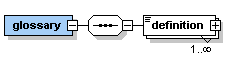 |
Description: <glossary> is a sub-element of the <lesson> element. It can contain one or more of the sub-elements <definition>. The glossary part of a lesson allows with the help of the element <definition> to list and describe all new or uncommon vocabulary and specialized terms used within the lesson. |
The element <glossary> occurs once within the <lesson> element.
Attribute(s):
none
 |
Description: The element <definition> can contain simple text or one or more of the elements listed in the graphic on the left hand side. Each element <definition> comprises the meaning (definition) of a new, uncommon, or specialized term used within the lesson. |
The element <definition> occurs at least once but as many times as needed within the <glossary> element.
Attribute(s):
| Name: | Use: | Value: |
| term | required | The term, written as it is normally used into the attribute term, serves as ID to reference the definition. It needs to be unique within a lesson. Blanks and special characters are allowed. Examples for terms would be 'Spatial Database' or 'Semantic'. |
| bibIDRef | optional | If you have taken the definition from a source listed in the bibliography then you can reference the respective bibliography entry in the attribute bibIDRef. The value of the attribute bibIDRef needs to be the same as the value of the attribute bibID of the respective bibliography entry. |
4.2 Unit Level
The unit level consists of the elements <entry>, <goals>,
<learningObject>, <selfAssessment>, <summary> and <furtherReading>.
The element <learningObject> consists of the elements <clarify>,
<look> and <act> which are also described in this section.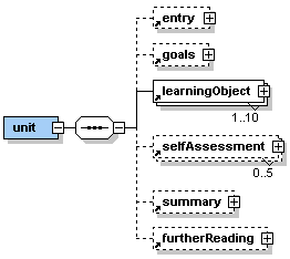 |
Description: <unit> is a very important element within the <lesson> element. Direct sub-elements of <unit> are the basic elements of every eLearning unit <entry>, <goals>, <learningObject>, <selfAssessment>, <summary>, and <furtherReading>. No text is allowed directly inside the <unit> element. A lesson is subdivided by at least one but up to ten units. A unit is a closed topic inside the lesson. Try to keep all units within a lesson about the same size. Sometimes it might be advisable to split up a extensive topic into two units instead of creating one very big unit. Try to give your units short and meaningful titles. |
The element <unit> occurs once or up to ten times within the <lesson> element.
Attribute(s):
| Name: | Use: | Value: |
| label | required | The attribute label can contain a user defined label of the unit. The label is defined to consist of up to 12 characters (a-z, A-Z, 0-9 and _). Labels need to be unique within a lesson. |
| title | required | The attribute title contains a string representing the title of the current eLearning unit. |
| role | optional | The attribute role can contain the values 'tutor' or 'student'. Default value is 'student'. However, it is possible to define a unit (e.g. with background information to the lesson or other units) which is not visible to the student by setting the value of the attribute role to 'tutor'. |
|
Description: <entry> is the first sub-element of the <unit> element. It can contain one or more of the sub-elements listed in the graphic on the left hand side. The <entry> element on unit level is essentially the same element as on lesson level. However, it applies to the unit. In the <entry> element there is place to make introductory statements. An 'entry' could, for example, be: - what is to be discussed in this unit - the context in which this unit fits - a scenario to personify this unit - an explanation of why this topic is being introduced - the historical perspective in which this unit fits - etc. |
The element <entry> is optional but may occur once within the <unit> element.
Attribute(s):
| Name: | Use: | Value: |
| label | optional | The attribute label can contain a user defined label of the entry part. The label is defined to consist of up to 12 characters (a-z, A-Z, 0-9 and _). Labels need to be unique within a lesson. |
| title | optional | The attribute title contains a string representing the title of the entry part. |
|
Description: <goals> is the second sub-element of the <unit> element. It contains at least one but up to ten elements <lObjective>. The <goals> element on unit level is essentially the same element as on lesson level. However, it applies to the unit. |
The element <goals> occurs once within the <unit> element.
Attribute(s):
none
|
Description: Each <lObjective> should contain one learning objective in text form. The learning objectives are instructions about what we want the student to be able to do/to know after they have studied this unit. Use verbs and include specific conditions (how well or how many) that describe to what degree the students will be able to demonstrate mastery of the task. For examples see Element <lObjective> in section 4.1.3. |
The element <lObjective> occurs at least once but up to ten times within the <goals> element.
Attribute(s):
| Name: | Use: | Value: |
| role | optional | The attribute role can contain the values 'tutor' or 'student'. Default value is 'student'. However, it is possible to define learning objectives which are not visible to the student by setting the value of the attribute role to 'tutor'. |
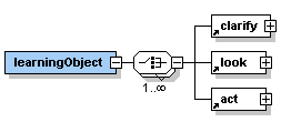 |
Description: <learningObject> is the second sub-element of the <unit> element. It can contain the sub-elements <clarify>, <look>, and <act> in random order. A learning object needs to consist of at least one of the sub-elements but there is no limit (except common sense) of how often and in which order the sub-elements are used. Try to give your learning objects short and meaningful titles. |
The element <learningObject> occurs once within the <unit> element.
Attribute(s):
| Name: | Use: | Value: |
| label | optional | The attribute label can contain a user defined label of the learning object. The label is defined to consist of up to 12 characters (a-z, A-Z, 0-9 and _). Labels need to be unique within a lesson. |
| title | required | The attribute title contains a string representing the title of the learning object. |
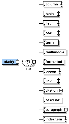 |
Description: <clarify> is one of the sub-element of the <learningObject> element. It can contain one or more of the sub-elements listed in the graphic on the left hand side. The clarify part represents what exactly is being taught in this learning object. It could, for example, be: - the concepts conveyed - principles used - an audio lecture or other recordings - etc Learning object example: |
The element <clarify> occurs zero, once or more times within the <learningObject> element. However, at least one of the elements <clarify>, <look>, or <act> has to exist once within the element <learningObject>.
Attribute(s):
| Name: | Use: | Value: |
| label | optional | The attribute label can contain a user defined label of the clarify part. The label is defined to consist of up to 12 characters (a-z, A-Z, 0-9 and _). Labels need to be unique within a lesson. |
| title | optional | The attribute title contains a string representing the title of the clarify part. |
 |
Description: <look> is one of the sub-element of the <learningObject> element. It can contain one or more of the sub-elements listed in the graphic on the left hand side. The look part allows students to review examples or samples that model what is being taught. Basically, <look> equals "here is what I mean" and could be accomplished with any of the following: - presentation of real-world problems - life-demonstrations - images, animated objects which help to understand the concepts - etc. The examples used in this part should be illustrated and explained. Learning object example: |
The element <look> occurs zero, once or more times within the <learningObject> element. However, at least one of the elements <clarify>, <look>, or <act> has to exist once within the element <learningObject>.
Attribute(s):
| Name: | Use: | Value: |
| label | optional | The attribute label can contain a user defined label of the look part. The label is defined to consist of up to 12 characters (a-z, A-Z, 0-9 and _). Labels need to be unique within a lesson. |
| title | optional | The attribute title contains a string representing the title of the look part. |
 |
Description: <act> is one of the sub-element of the <learningObject> element. It can contain one or more of the sub-elements listed in the graphic on the left hand side. The act part encourages the students to practice what is being taught. This is where to place facilities for hands-on experiences. It equals the classical lab-exercises and hands-on workshops. It should be an important integrative part of the eLearning unit, as it actively engages the students. An act part could, for example, be: - to read an article and write a short summary - solve and/or experience an online interactivity - online instructions to practice with software the students have installed on their computers - create groups of students to work on a problem or task (whiteboard, chat) - etc. This part can also help to create a community of learners what is a big challenge of online education. It is very important to have students share and exchange. Learning object example: |
The element <act> occurs zero, once or more times within the <learningObject> element. However, at least one of the elements <clarify>, <look>, or <act> has to exist once within the element <learningObject>.
Attribute(s):
| Name: | Use: | Value: |
| label | optional | The attribute label can contain a user defined label of the act part. The label is defined to consist of up to 12 characters (a-z, A-Z, 0-9 and _). Labels need to be unique within a lesson. |
| title | optional | The attribute title contains a string representing the title of the act part. |
| metaSetUpInfo | required | The attribute metaSetUpInfo contains simple text giving instructions to the tutors using the lesson with this act part in a course. For example, an act part might require the setup of a discussion board with the discussion topic 'Problems with SQL' and a whiteboard for student group work. Then the author of the lesson writes the instruction "Set up discussion topic 'Problems with SQL'; set up whiteboard for student group work" in the attribute metaSetUpInfo. This information will be shown if the lesson content is viewed in the tutors view. |
|
Description: <selfAssessment> is an optional sub-element of the <unit> element. It can contain one or more of the sub-elements listed in the graphic on the left hand side. The <selfAssessment> element on unit level is essentially the same element as on lesson level. However, it applies to the unit. The self assessment part of a unit should allow the student to check if they have achieved the learning objectives listed at the beginning of the unit. This part can also help to create a community of learners. It is very important to have students share and exchange. A self assessment part could, for example, contain: - an un-assessed quiz to check the learners achievements - a peer evaluation of each other's work - a reflection of the unit content through journal entries - engagement in team projects - participation in specific chat rooms - etc. It is important that all self assessment activities include some sort of feedback. Some feedback can be automated, for example, by online quizzes that provide the students with the correct answer or with links about where to go to get the correct answers. Other assessments may need peer feedback or feedback directly from the teacher. |
The element <selfAssessment> is optional but may occur up to five times within the <unit> element.
Attribute(s):
| Name: | Use: | Value: |
| label | optional | The attribute label can contain a user defined label of the self assessment part. The label is defined to consist of up to 12 characters (a-z, A-Z, 0-9 and _). Labels need to be unique within a lesson. |
| title | optional | The attribute title contains a string representing the title of the self assessment part. |
| metaSetUpInfo | required | The attribute metaSetUpInfo contains simple text giving instructions to the tutors using this lesson in a course. For example, a self assessment part might require the setup of a discussion board with the discussion topic 'Problems with SQL'. In this case the author of the lesson writes the instruction "Set up discussion topic 'Problems with SQL'" in the attribute metaSetUpInfo. This information will be shown if the lesson content is viewed in the tutors view. |
|
Description: <summary> is an optional sub-element of the <unit> element. It can contain one or more of the sub-elements listed in the graphic on the left hand side. The <summary> element on unit level is essentially the same element as on lesson level. However, it applies to the unit. The summary part of a unit provides an opportunity to summarize the experience, to encourage reflection about the process, to extend and generalize what was learned, or some combination of these. This part can be important as it rounds out the unit. It is important that the summary condenses rather than describes knowledge. It should repeat in concise form the facts that learners should remember and not just list areas of knowledge. Sometimes it might be a good idea to summarize in graphics. It is possible to use a diagram, chart, table, or other graphical format if it is the best way to summarize content. |
The element <summary> occurs zero or once within the <unit> element.
Attribute(s):
| Name: | Use: | Value: |
| label | optional | The attribute label can contain a user defined label of the summary part. The label is defined to consist of up to 12 characters (a-z, A-Z, 0-9 and _). Labels need to be unique within a lesson. |
| title | optional | The attribute title contains a string representing the title of the summary part. |
|
Description: <furtherReading> is an optional sub-element of the <unit> element. It can contain one or many of the sub-elements <resItem>. The <summary> element on unit level is essentially the same element as on lesson level. However, it applies to the unit. The further reading section of a unit can contain an excerpt of the bibliography of the lesson. The excerpt should contain the literature, websites, etc. that are especially recommended for the learner to study if he/she wants additional information to the topic introduced in this unit. |
The element <furtherReading> occurs zero or once within the <unit> element.
Attribute(s):
none
|
Description: Each element <resItem> contains a reference to literature listed in the bibliography (as an attribute). Additionally, the element can contain simple text describing, for example, which part of the book, website, … is especially recommended or why this journal article, CD-Rom,… is recommended. For examples see Element <resItem> in section 4.1.7. |
The element <resItem> occurs at least once but as many times as needed within the <furtherReading> element.
Attribute(s):
| Name: | Use: | Value: |
| bibIDRef | required | The attribute bibIDRef contains the reference to literature listed in the bibliography of this lesson. The value of the attribute needs to be the same as the value of the attribute bibID of one of the bibliography entries. |
4.3 Further Elements
 |
Description: These elements can be used within the sub-elements of lessons and units. Which elements are allowed is defined by the content models of each lesson or unit sub-element. Some of these elements have semantic names like paragraph while others have names that represent the presentation of the element like box or popup. For more information about the dilemma of using semantic or presentational tag names see the discussion in section 1.2. According to the content model of each element the nesting of these elements is allowed. Therefore, there might a formatted element be used within a box element. Some elements like columns or tables are always represented as separate paragraphs. Other elements like multimedia or link can be represented as paragraphs or inline with text. If such an element is used alongside with other paragraph elements then it is displayed as separate paragraph. If it is used within another paragraph element then it is represented inline with the text in this paragraph. |
 |
Description: <column> is an element which allows to structure the page presentation into two or three vertical parts (columns). It has two (<columnLeft> and <columnRight>) or three (<columnLeft>, <columnMiddle>, and <columnRight>) sub-elements depending on the structure one wants to achieve. |
The element <column> occurs zero, once or as many times as needed within the elements <entry>, <clarify>, <look>, <act>, <selfAssessment>, and <summary>.
Attribute(s):
| Name: | Use: | Value: |
| label | optional | The attribute label can contain a user defined label of the column. The label is defined to consist of up to 12 characters (a-z, A-Z, 0-9 and _). Labels need to be unique within a lesson. |
<column label="columnLabel">
<columnLeft align="left" width="100" units="pixels">This is the left column.</columnLeft>
<columnMiddle align="middle" width="200" units="pixels">This is the middle column.</columnMiddle>
<columnRight align="right" width="100" units="pixels">This is the right column.</columnRight>
</column>
Presentation:

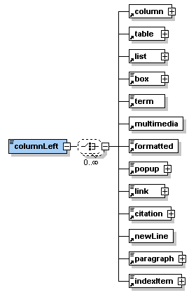 |
Description: <columnLeft> is a sub-element of the <column> element. It can contain simple text or one or many of the sub-elements listed in the graphic on the left hand side. The element <columnLeft> defines the left column of a two or three column structure. |
The element <columnLeft> occurs once within the <column> element.
Attribute(s):
| Name: | Use: | Value: |
| align | optional | The attribute align allows the values 'left', 'middle', 'right', 'top', 'bottom', 'texttop', 'absmiddle', and 'absbottom'. These values define the alignment of the content of the column. For an explanations of the values see section 5.1.1. |
| width | optional | The attribute width allows to specify the width of the left column as a number. If the width is not specified then a suitable width is chosen for the presentation. |
| height | optional | The attribute height allows to specify the height of the left column as a number. However, this is not supported by older browsers. If the attribute height is missing then a suitable height is chosen for the presentation. |
| units | optional | The attribute units allows to specify of what unit (percent or pixels) the numbers specified in the attributes width and height are. |
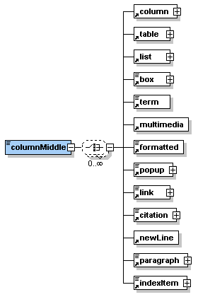 |
Description: <columnMiddle> is an optional sub-element of the <column> element. It can contain simple text or one or many of the sub-elements listed in the graphic on the left hand side. The element <columnMiddle> defines the middle column of a three column structure. |
The element <columnMiddle> occurs zero or once within the <column> element.
Attribute(s):
| Name: | Use: | Value: |
| align | optional | The attribute align allows the values 'left', 'middle', 'right', 'top', 'bottom', 'texttop', 'absmiddle', and 'absbottom'. These values define the alignment of the content of the column. For an explanations of the values see section 5.1.1. |
| width | optional | The attribute width allows to specify the width of the middle column as a number. If the width is not specified then a suitable width is chosen for the presentation. |
| height | optional | The attribute height allows to specify the height of the middle column as a number. However, this is not supported by older browsers. If the attribute height is missing then a suitable height is chosen for the presentation. |
| units | optional | The attribute units allows to specify of what unit (percent or pixels) the numbers specified in the attributes width and height are. |
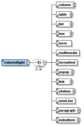 |
Description: <columnRight> is a sub-element of the <column> element. It can contain simple text or one or many of the sub-elements listed in the graphic on the left hand side. The element <columnRight> defines the right column of a two or three column structure. |
The element <columnRight> occurs once within the <column> element.
Attribute(s):
| Name: | Use: | Value: |
| align | optional | The attribute align allows the values 'left', 'middle', 'right', 'top', 'bottom', 'texttop', 'absmiddle', and 'absbottom'. These values define the alignment of the content of the column. For an explanations of the values see section 5.1.1. |
| width | optional | The attribute width allows to specify the width of the right column as a number. If the width is not specified then a suitable width is chosen for the presentation. |
| height | optional | The attribute height allows to specify the height of the right column as a number. However, this is not supported by older browsers. If the attribute height is missing then a suitable height is chosen for the presentation. |
| units | optional | The attribute units allows to specify of what unit (percent or pixels) the numbers specified in the attributes width and height are. |
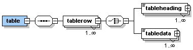
Description:
The element <table> allows to insert a table which can be defined
through the use of table rows, heading and data cells.
The following graphic shows how the sub-elements (described below) of
the element <table> are used to create a table.
The use of the element <table> starts the definition of a table.
Each row of the table is started with <tablerow> and ended with
</tablerow>. The first table row might contain <tableheading>
element but does not need to. Normally, a table row contains <tabledata>
elements.

Note that the number of table headings in the first row and the
number of table data cells in each further should be the same. Therefore,
in the first row the number of columns of the table is defined through
the number of table heading or table data cells defined. It is possible
to leave table heading or table data cells empty. However, the start and
end tag of the respective table heading or table data cell needs to be
defined.
Multiplicity:
The element <table> occurs zero, once or as many times as needed
within almost all elements which can contain content.
Attribute(s):
| Name: | Use: | Value: |
| label | optional | The attribute label can contain a user defined label of the table. The label is defined to consist of up to 12 characters (a-z, A-Z, 0-9 and _). Labels need to be unique within a lesson. |
| title | optional | The attribute title can contain a string representing the title of the table. |
| icon | optional | The attribute icon allows to mark the table as 'important', 'question', or 'remark'. For an explanations of the values see section 5.1.2. |
| width | optional | The attribute width allows to specify the width of the whole table as a number. If the width is not specified then a suitable width is chosen for the presentation. |
| height | optional | The attribute height allows to specify the height of the whole column as a number. However, this is not supported by older browsers. If the attribute height is missing then a suitable height is chosen for the presentation. |
| units | optional | The attribute units allows to specify of what unit (percent or pixels) the numbers specified in the attributes width and height are. |
| legend | optional | The attribute legend can contain a string representing the legend for the table. |
| bibIDRef | optional | If the table is copied from literature listed in the bibliography then the attribute bibIDRef allows to reference the respective bibliography entry. The value of the attribute needs to be the same as the value of the attribute bibID of the respective bibliography entry. |
XML Example:
<table label="tableLabel"
title="This is a table"
legend="An important table"
bibIDRef="b1"
width="500" units="pixels">
<tablerow>
<tableheading align="middle"
width="200" units="pixels">First
table heading</tableheading>
<tableheading align="middle">Second
table heading</tableheading>
</tablerow>
<tablerow>
<tabledata align="left">some
information</tabledata>
<tabledata align="right">other
information</tabledata>
</tablerow>
<tablerow>
<tabledata align="middle">second
row</tabledata>
<tabledata align="right">second
row, second cell</tabledata>
</tablerow>
</table>
Presentation:

 |
Description: <tablerow> is a sub-element of the <table> element. It can contain either <tableheading> or <tabledata> sub-elements. |
The element <tablerow> occurs once or as many times as needed within the <table> element.
Attribute(s):
none
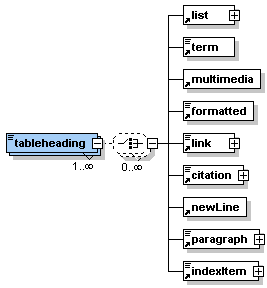 |
Description: <tableheading> is a sub-element of the <tablerow> element. It can contain simple text or one or many of the sub-elements listed in the graphic on the left hand side. The element <tableheading> defines the header section of a table. As table heading cells are only allowed in the first column the number of table heading cells also defines the number of columns a table has. |
The element <tableheading> occurs zero, once or as many times as needed within the first <tablerow> element.
Attribute(s):
| Name: | Use: | Value: |
| align | optional | The attribute align allows the values 'left', 'middle', 'right', 'top', 'bottom', 'texttop', 'absmiddle', and 'absbottom'. These values define the alignment of the content of the table heading cell. For an explanations of the values see section 5.1.1. |
| width | optional | The attribute width allows to specify the width of the table heading cell as a number. If the width is not specified then a suitable width is chosen for the presentation. |
| height | optional | The attribute height allows to specify the height of the whole tablerow as a number. However, this is not supported by older browsers. If the attribute height is missing then a suitable height is chosen for the presentation. |
| units | optional | The attribute units allows to specify of what unit (percent or pixels) the numbers specified in the attributes width and height are. |
| rowspan | optional | The attribute rowspan allows to define how many rows are spanned by this table heading cell. The value of the attribute must be a positive number. Note, that the table needs at least as many rows as are to be spanned. |
| colspan | optional | The attribute colspan allows to define how many columns are spanned by this table heading cell. The value of the attribute must be a positive number. Note, that the table needs at least as many columns as are to be spanned. |
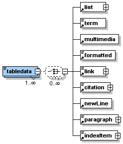 |
Description: <tabledata> is a sub-element of the <tablerow> element. It can contain simple text or one or many of the sub-elements listed in the graphic on the left hand side. The element <tabledata> defines simple data cells in the table. If there is no header section defined for the table then the number of table data cells in the first row defines the number of columns the table has. |
The element <tabledata> occurs zero, once or as many times as needed within the <tablerow> element.
Attribute(s):
| Name: | Use: | Value: |
| align | optional | The attribute align allows the values 'left', 'middle', 'right', 'top', 'bottom', 'texttop', 'absmiddle', and 'absbottom'. These values define the alignment of the content of the table data cell. For an explanations of the values see section 5.1.1. |
| width | optional | The attribute width allows to specify the width of the table data cell as a number. If the width is not specified then a suitable width is chosen for the presentation. |
| height | optional | The attribute height allows to specify the height of the whole tablerow as a number. However, this is not supported by older browsers. If the attribute height is missing then a suitable height is chosen for the presentation. |
| units | optional | The attribute units allows to specify of what unit (percent or pixels) the numbers specified in the attributes width and height are. |
| rowspan | optional | The attribute rowspan allows to define how many rows are spanned by this table data cell. The value of the attribute must be a positive number. Note, that the table needs at least as many rows as are to be spanned. |
| colspan | optional | The attribute colspan allows to define how many columns are spanned by this table data cell. The value of the attribute must be a positive number. Note, that the table needs at least as many columns as are to be spanned. |
 |
Description: <list> is an element that allows to insert ordered and unordered lists of items. It has one or as many as needed sub-elements <item>. |
The element <list> occurs zero, once or as many times as needed within the elements <entry>, <clarify>, <look>, <act>, <selfAssessment>, <summary> and most of the other paragraph elements like <box>, <table>, <list> or <column>.
Attribute(s):
| Name: | Use: | Value: |
| label | optional | The attribute label can contain a user defined label of the list. The label is defined to consist of up to 12 characters (a-z, A-Z, 0-9 and _). Labels need to be unique within a lesson. |
| title | optional | The attribute title can contain a string representing the title of the list. |
| icon | optional | The attribute icon allows to mark the list as 'important', 'question', or 'remark'. For an explanations of the values see section 5.1.2. |
| listStyle | optional | The attribute listStyle allows to define if a list is ordered (items ordered by numbers, e.g. 1., 2., …) or unordered (items listed with bullets). |
| bibIDRef | optional | If the list is copied from literature listed in the bibliography then the attribute bibIDRef allows to reference the respective bibliography entry. The value of the attribute needs to be the same as the value of the attribute bibID of the respective bibliography entry. |
<list title="This is an unordered list" label="listLabel" listStyle="unordered">
<item>First item</item>
<item>Second item</item>
<item>Third item</item>
<item>etc.</item>
</list>
Presentation:

 |
Description: <item> is the sub-element of the <list> element. It can contain simple text or one or many of the sub-elements listed in the graphic on the left hand side. The element <item> defines a single entry in a list. Therefore, a list with four entries would contain four elements <item>. |
The element <item> occurs once or as many times as needed within the <list> element.
Attribute(s):
none
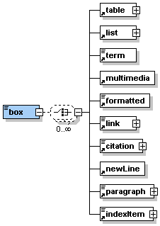 |
Description: <box> is an element that allows to insert a paragraph which is bordered by a line. Therefore, representing text in a box. It can contain simple text or one or many of the sub-elements listed in the graphic on the left hand side. |
The element <box> occurs zero, once or as many times as needed within the elements <entry>, <clarify>, <look>, <act>, <selfAssessment>, <summary> and some of the other paragraph elements like <table> or <column>.
Attribute(s):
| Name: | Use: | Value: |
| label | optional | The attribute label can contain a user defined label of the box. The label is defined to consist of up to 12 characters (a-z, A-Z, 0-9 and _). Labels need to be unique within a lesson. |
| title | optional | The attribute title can contain a string representing the title of the box. |
| icon | optional | The attribute icon allows to mark the box as 'important', 'question', or 'remark'. For an explanations of the values see section 5.1.2. |
<box label="boxLabel" title="This is the title of this box" icon="important">This box is marked important. <newLine/>text text text text text text text text text text text text text text text text text text text text text text text text text text text text text text text text text text text text text text text text text text text text text text text text text text text text text text text text text text text text text text text text text text text text text text text text text text text text text text text text text text text text text text text text text text text text text text text text text text text text text text text text text
</box>
Presentation:

 |
Description: The element <term> allows to reference a definition of specific term. It is used to mark up specific terms for which a definition exists in the glossary (see section 4.1.8 for more information on the glossary). If a word or a couple of words are marked up as <term> within a paragraph then these words are shown in bold. Holding the mouse pointer over these words the definition will popup in small window. If a word or a couple of words are marked up as <term> alongside to another paragraph then the definition saved in the glossary is inserted into the presentation as paragraph at this place. See the examples below to understand this better. |
The element <term> occurs zero, once or as many times as needed within the elements <entry>, <clarify>, <look>, <act>, <selfAssessment>, <summary> and most of the other paragraph elements like <paragraph>, <table>, <box> or <column>.
Attribute(s):
| Name: | Use: | Value: |
| glossRef | required | The attribute glossRef contains the reference to the definition in the glossary of the lesson. The value of the attribute needs to be the same as the value of the attribute term of the respective glossary entry. |
| icon | optional | The attribute icon allows to mark the box as 'important', 'question', or 'remark'. For an explanations of the values see section 5.1.2. |
XML Example:
<paragraph> text text
text text text text text text text text text text text text text text
text text text text text text text text text text text text text text
text text text text specific term <term
glossRef="definition">definition</term>
text text text text text text text text text text text text text text
text text text text text text text text text text text text text text
text text text text text text text text text text text text text text
text text text text text
</paragraph>
Presentation:
Within a paragraph the marked up term is shown in bold.

Moving the mouse pointer over the term in bold (leave it there for a few
seconds) shows the definition in a small popup window (the text of the
definition only, no images).

XML Example II:
<term glossRef="definition">definition</term>
And this it how it looks in the glossary
<glossary>
<definition term="definition">
1) a formal and concise statement of the meaning of a word, phrase, etc.<newLine/>
2) the act of defining a word, phrase, etc.<newLine/>
3) specification of the essential properties of something, or of the criteria
which uniquely identify it<newLine/>
4) the act of making clear or definite<newLine/>
5) the state or condition of being clearly defined or definite<newLine/>
6) a measure of the clarity of an optical, photographic, or television
image as characterized by its sharpness and contrast
</definition>
</glossary>
Presentation:

 |
Description: |
The element <indexItem> occurs zero, once or as many times as needed within the elements <entry>, <clarify>, <look>, <act>, <selfAssessment>, <summary> and most of the other paragraph elements like <paragraph>, <table>, <box> or <column>.
Attribute(s):
| Name: | Use: | Value: |
| mainEntry | optional | The attribute mainEntry allows to define if this indexItem is the main entry which means that around here this element is explained or used in its main context. If mainEntry is set to 'yes' then the index item will be shown bold in the text. Setting no attribute mainEntry means the same as setting the attribute to 'no'. |
| affiliatedTo | optional | The attribute affiliatedTo allows to have one single notation in the final index for words/indexItems with different notations. For example if the words 'houses' and 'housed' are marked up as indexItems then the attribute affiliatedTo might be set to 'house'. This means that the marked up entries show up as 'house' in the final index. If no attribute affiliatedTo is set then the word is taken in the final index in the way it shows up in the text. |
XML Example:
<paragraph> text text
text text text text text text text text text text text text text text
text text text text text text text text text text text text text text
text text text text specific term <indexItem
mainEntry="yes"
affiliatedTo="definition">definitions</indexItem>
text text text text text text text text text text text text text text
text text text text text text text text text text text text text text
text text text text text text text text text text text text text text
text text text text text
</paragraph>
 |
Description: The element <multimedia> allows to insert any types of media like, for example, images, flashs, vrml worlds, sound, svg graphics, etc. You specify them via the attributes. If you would like to include other types of information, such as javascripts, php etc. then you can fill them in the <multimedia> element or more exactly between the start and end tag. Please note that the content of the element <multimedia> is ignored by parsers and therefore not validated. |
The element <multimedia> occurs zero, once or as many times as needed within the elements <entry>, <clarify>, <look>, <act>, <selfAssessment>, <summary> and most of the other paragraph elements like <box>, <table>, <paragraph> or <column>.
Attribute(s):
| Name: | Use: | Value: |
| label | optional | The attribute label can contain a user defined label of the multimedia object. The label is defined to consist of up to 12 characters (a-z, A-Z, 0-9 and _). Labels need to be unique within a lesson. |
| icon | optional | The attribute icon allows to mark the multimedia object as 'important', 'question', or 'remark'. For an explanations of the values see section 5.1.2. |
| src | optional | The attribute src allows to specify the path to where the multimedia object is stored. This could, for example, be '../image/test.jpg' or '../multimedia/test.swf'. |
| mimeType | required | The attribute mimeType allows to specify the mimeType of the multimedia object. Values that are allowed are gif, jpeg, png, flash, svg, quicktime, mpeg, applet, vrml, realone, and div. Set the value to div if you would like include any other form of information such as javascripts, php, etc. |
| align | optional | The attribute align allows the values 'left', 'middle', 'right', 'top', 'bottom', 'texttop', 'absmiddle', and 'absbottom'. These values define the alignment of the multimedia object. For an explanations of the values see section 5.1.1. |
| width | optional | The attribute width allows to specify the width of the multimedia object as a number. Do not use the width and height elements to make images smaller (still the same size in bytes) or bigger (not nice to look at) but always define the size of the actual image. |
| height | optional | The attribute height allows to specify the height of the multimedia object as a number. Do not use the width and height elements to make images smaller (still the same size in bytes) or bigger (not nice to look at) but always define the size of the actual image. |
| units | optional | The attribute units allows to specify of what unit (percent or pixels) the numbers specified in the attributes width and height are. |
| legend | optional | The attribute legend can contain a string representing the legend for the multimedia object. |
| bibIDRef | optional | If the multimedia object is copied from literature listed in the bibliography then the attribute bibIDRef allows to reference the respective bibliography entry. The value of the attribute needs to be the same as the value of the attribute bibID of the respective bibliography entry. |
| thumbnail | optional | The attribute thumbnail allows to specify the path to where the respective thumbnail is stored. If this attribute is used then the thumbnail will be represented as link that leads to the original multimedia object. This might make sense, for example, for large images or flash movies. If there is a thumbnail then the values of the width and height attribute are specified for the thumbnail. |
| HTMLAttributes | optional | The attribute HTMLAttributes allows to specify any additional HTML attributes that are needed to represent a specific multimedia object. However, this is not yet implemented in the standard XSL. |
| visible | optional | The attribute visible allows to specify where a multimedia object is apparent. The values for selection are all (default), online or print. |
XML Example:
<multimedia src="../image/test.jpg"
mimeType="jpeg"
align="middle"
label="mediaLabel"
legend="This is an image"></multimedia>
Presentation:

XML Example:
<multimedia mimeType="div"><script
language="JavaScript">
function liveActionInternal(topHelpWindow, pluginId, className, argument)
{
alert("Die\u0020Hilfe\u0020muss\u0020lokal\u0020ausgef\u00FChrt\u0020werden\u002C
\u0020damit\u0020Aktionen\u0020der\u0020\u0027aktiven\u0020Hilfe\u0027\u0020verwendet
\u0020werden\u0020k\u00F6nnen\u002E");
return;}
function showTopicInContentsInternal(topHelpWindow, topic) {
try{
topHelpWindow.HelpFrame.NavFrame.displayTocFor(topic);
}catch(e){
} }</script></multimedia>
 |
Description: The element <formatted> allows to represent some text in a specific style . Allowed formats are bold, italic, underlined, crossedOut, upperCase, lowerCase, supscript, superscript, and code. It is recommended to use this tag not too often as it is contrary to a corporate layout. |
The element <formatted> occurs zero, once or as many times as needed within the elements <entry>, <clarify>, <look>, <act>, <selfAssessment>, <summary> and most of the other paragraph elements that can contain text like <box>, <table>, <paragraph> or <column>.
Attribute(s):
| Name: | Use: | Value: |
| style | required | The attribute style allows to define the style of the marked up
text. Allowed values are: bold bold text italic italic text underlined underlined text crossedOut upperCase UPPER CASE TEXT lowerCase lower case text subscript H2O, 2 is subscript text superscript 14.00, 00 is superscript text code class(), code within text |
<paragraph>
<formatted style="bold">bold</formatted> text<newLine/>
<formatted style="italic">italic</formatted> text<newLine/>
<formatted style="underlined">underlined</formatted> text<newLine/>
<formatted style="crossedOut">crossed out</formatted> text<newLine/>
<formatted style="upperCase">upper case</formatted> text<newLine/>
<formatted style="lowerCase">LOWER CASE</formatted> text<newLine/>
H<formatted style="subscript">2</formatted>O, 2 is subscript text<newLine/>
14.<formatted style="superscript">00</formatted>, 00 is superscript text<newLine/>
<formatted style="code">class()</formatted>, code within text
</paragraph>
Presentation:

 |
Description: The element <popup> allows to represent some text as a popup. This means that the text is not shown from the beginning but only when the user clicks on a link in the text. See the example below to understand how it works. The element <popup> can contain simple text or one or many of the sub-elements listed in the graphic on the left hand side. |
The element <popup> occurs zero, once or as many times as needed within the elements <entry>, <clarify>, <look>, <act>, <selfAssessment>, <summary> and some of the other paragraph elements that can contain text like <table> or <column>.
Attribute(s):
| Name: | Use: | Value: |
| label | optional | The attribute label can contain a user defined label of the popup. The label is defined to consist of up to 12 characters (a-z, A-Z, 0-9 and _). Labels need to be unique within a lesson. |
| title | optional | The attribute title can contain a string representing the title of the popup. |
| icon | optional | The attribute icon allows to mark the popup as 'important', 'question', or 'remark'. For an explanations of the values see section 5.1.2. |
<popup label="popupLabel" title="This is the title of this popup">This is a popup. The text is only shown after the user has clicked on the link.<newLine/>text text text text text text text text text text text text text text text text text text text text text text text text text text text text text text text text text text text text text text text text text text text text text text text text text text text text text text text text text text text text text text text text text text text text text text text text text text text text text text text text text text text text text text text text text text text text text text text text text text text text text text text text text
</popup>
Presentation:
This is how it looks before the user clicks on the orange link.

After the user has clicked on the orange link it looks like this.

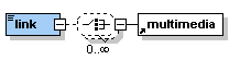 |
Description: The element <link> has several functions. It allows to link: - within the current lesson - to another lesson - to a resource within a lesson (e.g. PDF file, data file) - to an external resource (e.g. website, data file on another server) The element <link> can contain simple text or multimedia objects. If the element <link> is used alongside with other paragraphs then it is displayed as separate paragraph. If it is used within a paragraph the it is shown inline with the text. |
The element <link> occurs zero, once or as many times as needed within the elements <entry>, <clarify>, <look>, <act>, <selfAssessment>, <summary> and most of the other paragraph elements that can contain text like <paragraph>, <table>, <box> or <column>.
Attribute(s):
| Name: | Use: | Value: |
| uri | optional | The attribute uri is used to specify the path to a specific resource (e.g. a website). |
| targetLesson | optional | The attribute targetLesson is used to specify the label of the lesson that shall be linked. |
| targetLabel | optional | The attribute targetLabel allows to specify the label of any other element within the current lesson that shall be linked. |
| type | optional | The attribute type allows to specify from which type the linked resource is (e.g. pdf, shp, etc.). |
| size | optional | The attribute size is used to specify how big or small a linked resource is (e.g. 10KB or 123 MB). This shall allow the user to estimate the download time. |
| legend | optional | The attribute legend can contain a string that gives additional information about the resource linked. |
| icon | optional | The attribute icon allows to mark the popup as 'important', 'question', or 'remark'. For an explanations of the values see section 5.1.2. |
<paragraph>Link to the lesson</paragraph>
<link targetLesson="IntroToDBS">Introduction to Database Systems</link>
<paragraph>Displayed as a separate paragraph.</paragraph>
<paragraph>Link to the <link targetLabel="boxLabel">box element</link> within this lesson. Displayed inline with this text.</paragraph>
<link uri="../multimedia/test.pdf" legend="PDF for the exercise" size="56KB" type="PDF">Link to a PDF file (displayed as paragraph)</link>
<paragraph>The same <link uri="../multimedia/test.pdf" legend="PDF for the exercise" size="56KB" type="PDF">PDF file </link> link displayed inline (move the cursor over the link to see the additional information).</paragraph>
<link uri="http://www.fhbb.ch/geomatik/test.html" legend="Website of the Departement Surveying and Geoinformation at FHBB">Link to the VGI Website (displayed as paragraph)</link>
Presentation:

 |
Description: The element <citation> allows to cite from another resource. It can contain simple text and/or the elements <term>, <formatted> and <newLine>. <citation> allows different styles of citations: - cite a passage exactly from another resource - paraphrase a passage from another resource - display them inline or as separate paragraph |
The element <citation> occurs zero, once or as many times as needed within the elements <entry>, <clarify>, <look>, <act>, <selfAssessment>, <summary> and most of the other paragraph elements that can contain text like <paragraph>, <table>, <box> or <column>.
Attribute(s):
| Name: | Use: | Value: |
| label | optional | The attribute label can contain a user defined label of the citation. The label is defined to consist of up to 12 characters (a-z, A-Z, 0-9 and _). Labels need to be unique within a lesson. |
| BibIDRef | required | The attribute bibIDRef allows to reference the corresponding bibliography entry for this citation. The value of the attribute needs to be the same as the value of the attribute bibID of the respective bibliography entry. |
| pageNr | optional | The attribute pageNr allows to specify the page numbers of an exact citation. See the testLesson for an example use of this attribute. |
| icon | optional | The attribute icon allows to mark the citation as 'important', 'question', or 'remark'. For an explanations of the values see section 5.1.2. |
| yearOnly | optional | The attribute yearOnly allows to reference a bibliography entry with the year of publication only. Without the attribute (normal) the reference is made with author name and year of publication. See the testLesson for an example use of this attribute. |
<paragraph>The following is an exact citation inline with other text. Other authors write <citation bibIDRef="b1" pageNr="6" label="citLabel">that XML is easy to learn</citation>. Another author (paraphrased) would say that it needs some time to get into it <citation bibIDRef="b2"/>.<newLine/>To cite Harold and Means:</paragraph>
<citation bibIDRef="b3" pageNr="3">XML, the Extensible Markup Language, is a W3C-endorsed standard for document markup. It defines a generic syntax used to mark up data with simple, human-readable tags. It provides a standard format for computer documents. This format is flexible enough to be customized for domains as diverse as web sites, electronic data interchange, vector graphics, genealogy, real estate listings, object serialization, remote procedure calls, and voice mail systems.</citation>
Presentation:

 |
Description: The element <newLine> allows to enforce a line break within a paragraph. To different types of line breaks are distinguished. Short just starts a new line while long starts a new paragraph. |
The element <newLine> occurs zero, once or as many times as needed within the elements <entry>, <clarify>, <look>, <act>, <selfAssessment>, <summary> and most of the other paragraph elements that can contain text like <paragraph>, <table>, <box> or <column>.
Attribute(s):
| Name: | Use: | Value: |
| space | optional | The attribute space can have the values short or lang. Short starts a new line while long begins a new paragraph. Short is default value used when nothing else is defined. |
<paragraph>text text text text text text text text text text text text line break<newLine space="short"/>start a new line text text text text text text text text text text text text text text text text text text text text text text text text text text text text text text text text text text text text text text text text text text text text text text text text text text text text text text text text text text text text text text text text text text text text text text text text text text text text text text text text text text text text text text text text text text text text text text text text text text text text text text text text text text text text text text text text text text text text text text text text text text line break<newLine space="long"/>start a new paragraph text text text text text text text text text text text text text text text text text text text text text text text text text text text text text text text text text text text text text text text text text text text text text text text text text text text text </paragraph>
Presentation:

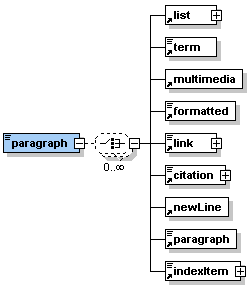 |
Description: The element <paragraph> allows to structure the text in different paragraphs. It can contain simple text or one or many of the sub-elements listed in the graphic on the left hand side. |
The element <paragraph> occurs zero, once or as many times as needed within the elements <entry>, <clarify>, <look>, <act>, <selfAssessment>, <summary> and some of the other paragraph elements like <table> or <column>.
Attribute(s):
| Name: | Use: | Value: |
| label | optional | The attribute label can contain a user defined label of the paragraph. The label is defined to consist of up to 12 characters (a-z, A-Z, 0-9 and _). Labels need to be unique within a lesson. |
| title | optional | The attribute title can contain a string representing the title of the paragraph. |
| icon | optional | The attribute icon allows to mark the paragraph as 'important', 'question', or 'remark'. For an explanations of the values see section 5.1.2. |
| role | optional | The attribute role can have the values tutor or student. Default value is student. Basically all paragraphs are visible to students. However, it is possible to set the role of a specific paragraph to tutor and, therefore, this paragraph will only be visible for tutors. This can be used to write, for example, some special instructions for tutors within a lesson. |
| visible | optional | The attribute visible allows to specify where a paragraph is apparent. The values for selection are all (default), online or print. |
<paragraph label="pLabel" title="This is a simple paragraph">text text text text text text text text text text text text text text text text text text text text text text text text text text text text text text text text text text text text text text text text text text text text text text text text text text text text text text text text text text text text text text text text text text text text text text </paragraph>
<paragraph title="This is a paragraph containing a remark (remark icon used)" icon="remark">text text text text text text text text text text text text text text text text text text text text text text text text text text text text text text text text text text text text text text text text text text text text text text text text text text text text text text text text text text text text text text text </paragraph>
<paragraph title="This is a paragraph for tutors only" role="tutor">text text text text text text text text text text text text text text text text text text text text text text text text text text text text text text text text text text text text text text text text text text text text text text text text text text text text text text text text text text text text text text text text text text text text text </paragraph>
Presentation:

Previous "eLML XML Schemas" | Top | TOC | Next "Bibliography"