|
|
|
|
|
|
|
|
What is Information Visualization?
Visual Information Seeking Mantra:
Overview first, zoom and filter, then details-on-demand. (Schneiderman)
Information Visualization is:
presenting information in such a way that as
much as possible can be assimilated by the human perceptual system instead
of relying on the human
cognitive system
presenting detailed information about a specific
topic while also presenting a complete overview of all information available
(the fisheye concept)
The term was introduced by Card et al. in
their seminal paper [CARD91]. They intended to draw on background in the
area of Scientific
Visualization. They saw parallels between
the two visualization fields in terms of their purpose (extracting salient
dimensions from multidimensionala
data) and their methods (using advanced 3D
graphics and animation techniques to present data. Since the time of that
paper. Information
Visualization has come to be regarded less
as a branch or offshoot of Scientific Visualization and more as an offshoot
of Human-Computer
Interaction (HCI). In particular, in keeping
with HCI's roots in both computer science and cognitive psychology, Information
Visualization now carries
the HCI torch of tailoring computer-to-human
communication technques to the human perceptual system.
Information visualization uses computer graphics
and interactive animation to stimulate recognition of patterns and structure
in information. It
does so by exploiting the human perceptual
system in ways similar to Scientific Visualization, which allows scientists
to perceive patters in
large data collections....Information visualization
works on the structure of information inherent in large information spaces.
[ROBE91b]
The basic problem is how to utilize advancing
graphics technology to lower the cost of finding information and accessing
it once found.
[ROBE93]
Visualization enables people to use a natural
tool of observation and processingÑtheir eyes as well as their brainÑto
extract knowledge more
efficiently and find insights. [GERS95b]
Information, then, need not be inherently spatial.
But because we live and perceive in a physical world, it is easier to convey
the information
to the observer if the information is represented
by being mapped to the familiar physical space. [GERS95b]
While the term "information visualization"
is coming into use, the goal is really "information perceptualization."
The latter implies a richer use
of many senses, including sound and touch,
to increase the rate at which people can assimilate and understand information.
[CARD96]
Using Perception
We speak of offloading the task of information assimilation from the
perceptual system to the cognitive system. This means that we tailor the
information
so that the eye can quickly distinguish salient features before the
brain begins to process it. The perceptual system operates in a time range
of 10 to 100
milliseconds. The cognitive systems operated in a time range of hundreds
of milliseconds to several minutes. If we can tailor the information such
that the
perceptive system can process, we can speed the task of human information
assimilation by several orders of magnitude.
To do this, we must present the information using features that the eye can distinguish quickly. These features include, but are not limited to, the following:
color
size
shape
location / position
others?
We use these features, and look for others that aid the human perceptual system in distinguishing salient information.
Humans can recognize the spatial configuration of elements in a picture
and notice relationships among elements quickly. This highly developed
visual
system means people can grasp the content of a picture much faster
than they can scan and understand text.
Why Information Visualization?
This section discusses the rationale for looking at Information Visualization as a solution to assimilating information. It discusses the usual suspects:
the explosion of information available on the
WWW
larger hard disk sizes mean more information
available quickly
the mismatch between computer displays and
the human perceptual system
the mismatch between computer controls and
human motor functions
What information visualization provides that other interfaces do not:
a means of easily seeing trends in the data
a means of easily seeing outliers
a means of seeing jumps in the data (gaps)
a means of easily identifying maxima and minima
like largest, smallest, most recent, oldest, etc.
a means of identifying boundaries (not the
same as maxima or jumps)
a means of easily identifying clusters in
the data
a means of finding structure in heterogeneous
information
a means of seeing an enormous amount of data
on one display screen
a means of seeing a particular item of interest
within the context of an enormous amount of contextual data
Web
site maps are created by webmasters and content providers to help users
navigate and search complex web sites. A variety of styles of map are used,
many based on organisational charts. Presented here are some of the best
examples from around the Web.
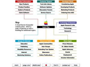
1- Organisational chart type site maps.
For example, Apple or Hilton Hotels Hilton.com web site from 1998 (Apple have since adopted a much more conventional site map and Hilton do not currently provide a site map.)
Fisheye Views
[SARK92] [SARK94]
Description
a fisheye view of a graph shows an area of interest quite large and
with detail and shows other areas successively smaller and in less detail.
it achieves
this smooth integration of local detail and global context by repositioning
and resizing the elements of the graph. [SARK94]
cartesian vs. polar transformations
A cartesian transformation has the property that all the vertical and horizontal lines remain vertical and horizontal after the transformation. [SARK94]
Advantages
user can control the distortion factors
Disadvantages
_lways keeps all the information on the screen,
which gets cluttered.
There is no satisfactory 2D layout of a large
tree, because of exponential growth.
Hyperbolic Tree Browser
Description
The essence of this scheme is to lay out the hierarchy in a uniform
way on a hyperbolic plane and map this plane onto a circular display region.
This
supports a smooth blending between focus and context, as well as continuous
redirection of the focus. [LAMP95]
components diminish in size towards the edges
of the display
exponential growth in the number of components
means we can display an infinite number of components
focus is in the center of the display, but
the tree can be moved so a different node is placed at the focal point
can display 1000 nodes, of which the nearest
50 can have text labels (2D browser can display only 100 nodes with 3-character
labels)
The circumference of a circle on the hyperbolic plane grows exponentially
with its radius, which means that exponentially more space is available
with
increasing distance. Thus hierarchiesÑwhich tend to expand exponentially
with depthÑcan be laid out in hyperbolic space in a uniform way,
so that the
distance (as measured in the hyperbolic geometry) between parents,
children, and siblings is approximately the same everywhere in the hierarchy.
[LAMP95]
Advantages
Can display a similar number of nodes as can the cone tree, but doesnÕt
require 3D animation support. Relatively modest computation needs because
itÕs 2D. This makes it useful on a wider variety of platforms.
displays more of a nodeÕs context in all directions (ancestors, siblings, and descendants) than the fractal layouts.
Disadvantages
Multiple Views
Description
provide the user with different hierarchies, each giving a different perspective on the underlying information space
networks are much harder to visualize then hierarchies uses a data structure called the pre-tree to convert a generalized graph into a tree
Two methods of clustering:
content analysis - based on attributes of the
nodes
structural analysis - based on the structure
of the subtrees
Three metrics for ranking possible pre-trees:
information lost in pre-tree formation (= entropy?)
ÒtreenessÓ of the branches -
similarity of the pre-tree to an actual tree
ÒgoodnessÓ of the root - look
for shortest sum-of-distance from root to all other nodes
Advantages
Disadvantages
Dynamic Diagrams
Inc.
are a leading company in designing
web site maps and navigation tools. One of the graphic styles they use
is to maps sites in a perspective view, with individual web pages sticking
up, a bit like a card index. A good example of these is shown below, a
map of Britannica Online.
Existing Web Applications
There have already been many attempts to apply these visualization techniques to accessing the WWW. Some of these applications include the following:
Zooming Web Browser
Narcissus Clustering System
Harmony Internet Browser
MITRE enhancements to NCSA Mosaic
Navigational View Builder
Tabular Visualization (should perhaps be under
basic techniques?)
No Information Yet!
Personal infospace
Web Book
Web Forager
Zooming Web Browser
[BEDE96]
multiple pages and the links between them are
depicted on a large zoomable information surface
pages are scaled so that the page in focus
is clearly readable with connected pages shown at smaller scales to provide
context
layout changes are animated
pad++ allows www pages to remain visible at
varying scales while they are not specifically being visited, so the viewer
may examine many pages at
once.
The World Wide Web is a huge source of information. However, this information
is not very structured and can only be browsed by humans. In
order to make better use of web information, a joint effort is being
made towards Metadata, defined by the W3C as "machine understandable
information about web resources and other things".
With this idea, the eXtensible Markup Language (XML) has been proposed.
XML permits new markup languages to be defined. We have used
XML to define SGF, a format for describing Web sites as Structured
Graphs.
Structured Graphs are a mathematical formalism designed to support
scalable browsing and editing of large graphs. They were initally
developed in the context of project management and software engineering.
SGF has been defined to apply Structured Graphs to the web.
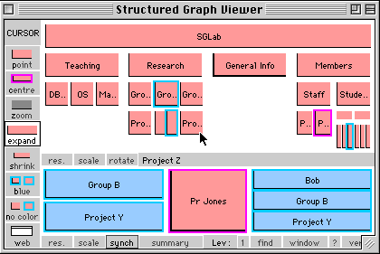
Figure 1 A screen shot of ISL
The above screen shot shows the viewer in action. The index
for our local site, the Information Systems Laboratory (ISL) has been loaded
into the viewer. Disregarding
tool bars and button bars, the top frame shows a hierarchy
view of the ISL site. The bottom frame shows a local network view for one
of the pages in the ISL site. Each
rectangle represents a web page. The text in each box
is a web page's title. Once you find the title of a page you are interested
in, set the cursor mode to WEB, by
clicking the bottom button in the left hand tool bar.
Then click in the box showing the title. The web page will then be launched.
In the hierarchy frame, parent pages are shown above their
child pages. One special box in the hierarchy has a pink border (you can
set the cursor mode to centre and
then click in another box to change this). The network
frame shows the local network of the pink box's web page. That is, its
source and destination pages. Sources are
shown on the left, destinations on the right.
In the hierarchy you can use zoom (set the cursor mode
to zoom and click a box) to see a page's sub-hierarchy in more detail.
Expand and contract can also be used to
do a similar job. In the network to see more levels of
sources and destinations click the number one which appears next to Levels
on the bottom button bar. To reverse
this, do an option (or alt depending on your platform)
- click.
An example
To get a better idea of using the viewer, lets walk through
an example session. We have decided to explore the ISL site. First we look
for faculty pages . In the previous
screen shot a box there is a box with the title "Facult".
This is most likely the one we are looking for. To check this, we move
the cursor onto this box. We can then read
its URL ".../faculty.htm/index.htm" in the centre
button bar. We want to see this page's sub-hierarchy in more detail, so
we place the the cursor in zoom mode (move
the cursor to the zoom icon in the left hand tool bar
and click it), then click the Faculty box.
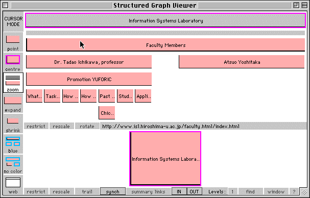
Figure 2 Zooming into Faculty
We see two faculty have pages here, Tadao Ichikawa and
Atsuo Yoshitaka. We now decide to track down the student web pages, these
are likely to be more
interesting. Looking at the first screen shot again, a
box on the right-hand side of the hierarchy shows the title "Stude". We
click this box (we are still in zoom mode),
and then click again on "index.htm".
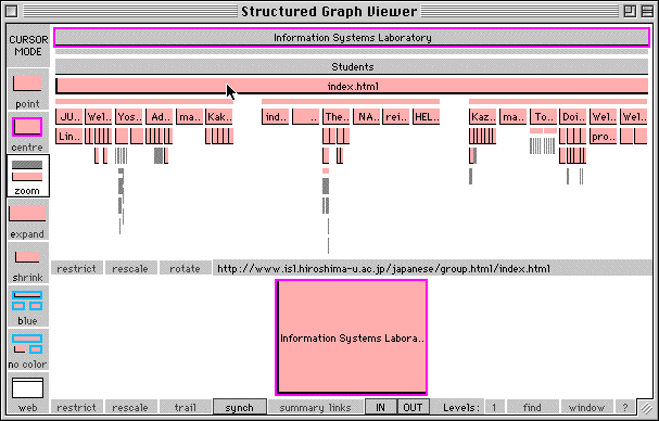
Figure 3 Zooming into students
It looks like we've found them. We want to see the first
group of student in more detail without loosing sight of the other students.
We change the cursor to expand
mode, then click on the thin bar above the first group
of student boxes on the left.
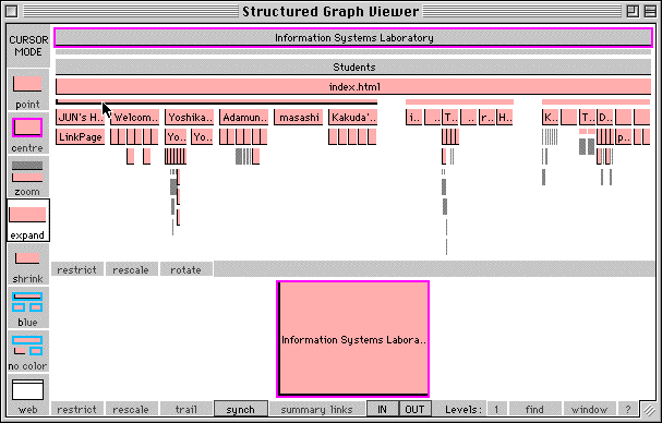
Figure 4 Expanding Jun's site
The first sub-hierarchy on the left is Jun's sub-site.
Since Jun is one of our project members, we like to see what he's been
doing with his web site, not linking to too
many manga sites we hope. We set the cursor mode to centre,
then click the box for Jun's home page. This box now has a pink border,
and the network has changed. It
shows Jun's page in the centre and a box titled "friends
link" as a source on the left. The source is also highlighted in the hierarchy
with a blue border.
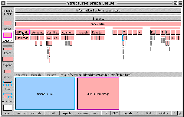
Figure 5 Centering the network on Jun
To see the source in the hierarchy better we click
the restrict button which is on the hierarchy button bar, (pressing the
space bar is a short cut for this). We can click
again to reverse this.
To try this for yourself visit the demo section of the SGF site.
One of the most knowledgeable people
in the nascent field of Web site mapping is Paul Kahn. In a recent e-mail,
Kahn said, "I think web
site mapping is bouncing back and forth between two poles: it is absolutely
necessary and it is impossible." On the one hand maps are vital for
giving people a familiar visual overview of a new, unknown territory
- the Web site. And yet, they are so hard to produce. Dynamic Diagrams,
Inc. has developed an innovative visual metaphor to represent Web site
structure which they call the Z-Diagram. It
is a 2.5d landscape view, with Web pages represented as small standing
cards. The metaphor was originally conceived by Krzysztof Lenk, a designer
and founding partner in the company, to display the structure of a multimedia
encyclopaedia [2].
Detailed, handcrafted, Z-Diagrams are
widely employed by Dynamic Diagrams as planning maps in their work designing
and
redesigning large Web sites. The figure below shows an example produced
to map the key structures of the design of the new Nature
Neuroscience Web site [3]. The hierarchical structure, volume of pages,
click-depth of pages, and access rights are all clearly mapped using
a combination of spatial layout and strong colour coding. Page cards
are laid out from bottom-left to top right showing progressive click depth
into the site from the home page. Simultaneously, different colour-coded
carpets, that get progressively higher on the map, designate different
levels of access (visitor, registered user and subscriber).
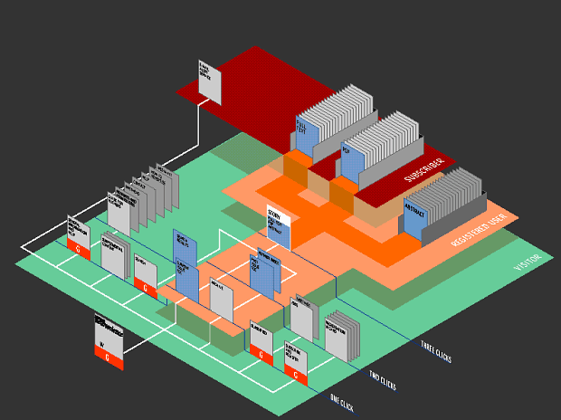
Map of the key design structures of the Nature Neuroscience Web site
© Dynamic Diagrams, Inc.
The Z-Diagram lays out the site
on an isometric plain which has a constant scale across the space. Kahn
says the Z-Diagram
was influenced by the famous Turgot map of Paris from the 1730s [4]
which employed the same geometric properties to provide
legible views of the crowded Parisian streets. And he argues,
"This use of depth without vanishing
point is the key. It is the point that is missed by many applications of
3D graphics
for navigation. The distortions of vanishing point perspective
are often counter to the principles of information design."
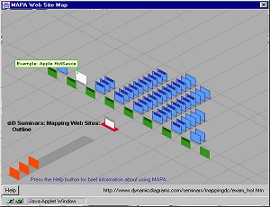
Dynamic Diagrams have also used a basic
Z-Diagram metaphor in an interactive site map for surfers [5]. Their system
is called
MAPA and users can request a simple Z-Diagram style map from any page
on a Web site and it will be displayed in a small pop-up
window showing the local structure. An example of the MAPA maps is
given in the figure below. Importantly, the MAPA system also
provides 'back-end' tools to analyse the structure of a large site
and derive the key hierarchical structure, which is stored in a
database from which the maps can be generated at the request of the
user. MAPA is, therefore, a data-driven Web site map rather
than a handcrafted one. The figure shows a screen-shot of the MAPA
map of part of the Javasoft Web site, with cards projecting
vertically from the ground plain representing the pages. The cards
are spatially arranged on the ground to reflect the dominant
hierarchical structure of the site without cluttering the screen with
multiple hyperlinks between pages. Different colour carpets
delineate different levels in the hierarchy.
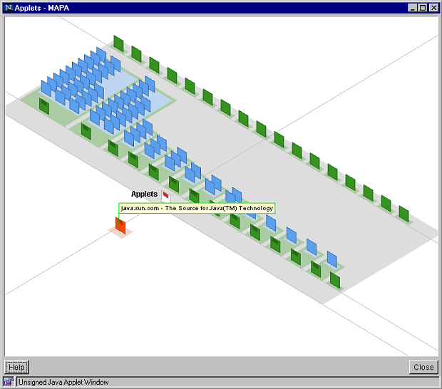
A portion of the Javasoft Web site as rendered by MAPA,
a data- driven Web site map system.
© Dynamic Diagrams, Inc.
Our location is shown, at the bottom-left, by the white card with a
red marker. In the figure, we are located on the 'Applets' Web
page and to our right are further pages in the site hierarchy. Cards
are ordered towards the top-right corner of the map, and each
layer represents a step deeper into the site. All child pages from
our location are shown on the map and they are equally spaced
along a horizontal diagonal line so they are spread out without overlap.
Further pages below these pages are spaced behind in
parallel rows. The number of rows gives an instant and intuitive visual
indication of the volume of pages from our location. Even though
some of these cards do overlap to varying degrees, at least part of
them is still visible to the user and can be queried using the
cursor. Simple colour coding is also used to further identify hierarchical
structure, so immediate child pages are shown in green and
further grandchild pages are blue. Below our location card, toward
the bottom-left, ancestor pages are shown by orange coloured
cards which delineate the steps back to the site's home page (note,
in the figure there is one ancestor page - the site homepage).
Users can interact with the MAPA map
in several ways. Firstly, passing the cursor over a card will cause it
to be highlighted and
for the title to be displayed as a flag. Titles are displayed in such
a manner that they are all visible with minimal overlapping. Users
can also navigate within the map itself by re-focusing the layout around
a different page. This is achieved by clicking on the cards
with a dark bar on them and the pages rearrange themselves in a smooth
animated transition. This is one of the key "wow factors" of
MAPA according to Kahn, who comments,
"Moving from one view to the next
without the animation would be incomprehensible. With the animation most
people
can get it. And it is fun to watch the pages march across the screen
and rise up out of the carpet."
Finally, MAPA can be used to move the user's browser to a different
page in the site simply by double clicking on a card of interest.
The MAPA system provides one of the most
innovative and effective interactive Web site maps currently available
[6]. As the field
of Web site mapping matures there will be many new examples which will,
hopefully, help the user answer the question "Where am I?"
All the documents read by Visual Web are stored on your hard disk by
Visual Web's Offline Proxy Server. That means you'll be able to access
the pages immediately, even without being online! Naturally, this works
with the web browser you are used to. You run Visual Web once, and
then can browse without having to wait for the download, which saves
a lot of time and money!
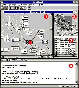
1.Main Window
2.Overview:
This
window shows the entire diagram, reduced in size.
Click/drag in the window to move the inverted area showing
which region of the diagram is displayed in the main window.
3.Page index:
Here, Visual Web lists the URL of each document.
4.Contents:
This
window shows the text of the current HTML document,
removing all HTML control sequences from the text. In this
manner, you can quickly browse the documents Visual Web
has retrieved from the diagram.
Here's
a bonus for all who are charged for their Internet access by time: as you
can work mostly offline, using
Visual Web will result in a steep reduction of your online charges!
Focus + Context
The Hyperbolic Tree is based on the principle of Focus+Context. Any part
of the
data may be put into focus (viewed in detail), leaving the rest of the
data as context
(unfocused). Items in context are very small, and cannot be seen in detail.
Rather,
they form patterns which can be used in two ways: to gain a better understanding
or presentation of the dataset as a whole, and to show relationships which
help
identify items of interest to be focused on.
Intuitive Navigation
The Hyperbolic Tree allows users to navigate intuitively through large
collections of
information. The Tree displays relationships, allowing users to spot patterns,
trends, abnormalities and other contextual truths not evident via traditional
interfaces. Users quickly learn what is there and where things are.
to see a demo, please go to: http://www3.inxight.com/htdbdemo/htdocs/index.htm
for another Demo see : Hyperbolic Tree Grocery Shopping Demo
http://www.inxight.com/demos/grocery/index.htm
![]()